 |
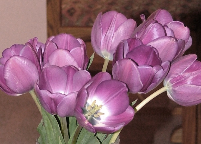
I wanted to paint this bouquet of purple
tulips that had come out last spring. However I wanted to have
the flowers in a verticle position and I wanted to have a more exciting
vibrant painting than the all purple group of flowers that I had here. |
 |
I decided to zoom in to the central area
and to use the open tulip as my center of interest. It is
important to make sure that the center of interest is located in one of
the quadrants away from the very center of the painting. I
cropped the edges off the image to make an interesting verticle
composition. I also placed the extra yellow tulip in the gap
between the flowers to provide a place to add the opposite colour to
the two painted purple tulips. I think of the tulips not as
drawings of flowers but as shapes that I can use to create a jig saw
puzzle of small, medium, and large shapes in my composition.
These shapes I can use to lay down a variety of pleasing colours
throughout my painting. |
 See the large painting |
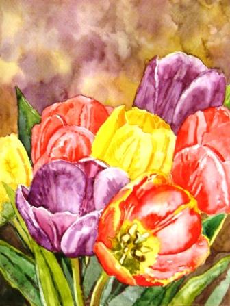
In order to make the composition more
vibrant and exciting I used complementary colours on the colour
wheel for the tulips and leaves. Complementary colours are
opposites on the colour wheel. The purple and yellow tulips are
opposites. When complementary colours are placed beside
each other they create a lovely glowing vibration that we see as
exciting. Whereas in contrast neighbouring colours on the colour
wheel (eg.red and orange) are called analagous colours and their use in
proximity creates a harmonious, restful feeling. The red tulips
are complementary to the green of the leaves and so add more colour
vibrancy. For the background I used a mixture of the purple
and yellow and allowed them to mingle a bit. When opposite paints
combine they create a greyed down version of the colours.
Being more neutral they offer a welcome place for the viewers eye to
rest from the colourful bright tulips. This is why the painting
seems to work so well. |
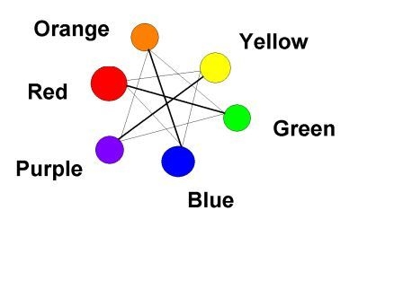 |
Now have you noticed which colours I didn't
use on this painting? If you said blue and orange you're
right. This painting wouldn't have looked as good if I had
introduced the 3rd primary colour blue and its complement orange.
Sometimes it is better to stick to a limited palette of colours.
I chose to avoid the use of orange as the yellow tulips, with orange,
and the red would have created a more harmonious restful feel by using
analagous neighbouring colours whereas I was looking for dynamic
vibration in this painting so chose instead to use opposite,
complementary colours with the red/green and purple/yellow pairs of
colours. |
 Click on Drawing |
You may print my drawing of tulips to
create your own painting. Click on the image to blow it up. Then
right-click on the image to print or save to your computer.
Please make sure you add the bit of the yellow tulip on the left side
of your painting that is missing from the drawing so you have that area
to place the bit of complementary yellow tulip that you see cut off the
left side. Happy Painting!!! Happy Spring!!! |

Click on the map to see original paintings
of that area by world artists